There is a consistent pattern we see across service businesses investing in ads, SEO, and branding. Traffic increases, the site looks professional, and the messaging feels decent. Yet the number of form submissions, calls, and qualified inquiries stays flat. At that point, the issue is rarely visibility. It is structure.
When a web development agency focuses solely on design rather than performance, the result is a digital brochure rather than a growth asset. A website is not there to exist. It is there to move people toward action. If that action is not happening, something inside the system is breaking.
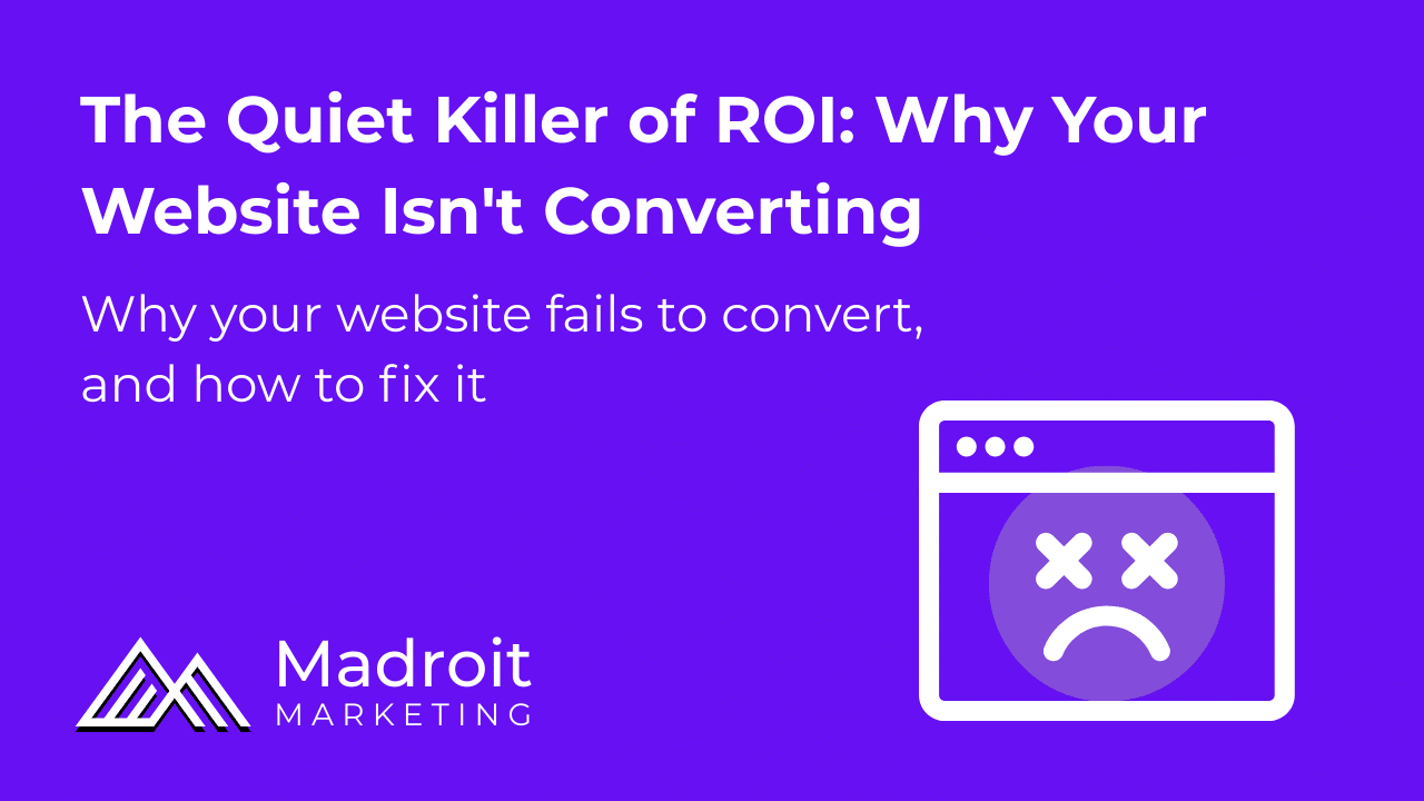
A website that looks sharp but doesn’t convert is not underperforming; it’s unfinished.
How to Tell Your Website Isn’t Working
A clean layout and modern visuals can create the illusion of performance. But performance is measured by behavior, not aesthetics. A performing website guides visitors toward a decision. A non-performing one leaves them browsing without direction.
The warning signs show up in three places: results, data, and feedback.
From a results standpoint, the indicators are clear. You are getting traffic but not seeing proportional inquiries. Ads are generating clicks without generating leads. SEO rankings improve, yet revenue does not follow.
From a data perspective, you may notice high bounce rates, low scroll depth, or visitors spending several minutes on the site without taking action. That behavior signals hesitation. Something is unclear or missing.
Customer feedback is often the most direct signal. Prospects say they were unsure what you actually do. They were not certain you service their area. They did not know what to click next. These are not cosmetic issues. They are structural breakdowns in website conversion.
You do not always need a full redesign to fix this. But if your messaging has evolved, your services have expanded, you are running ads that are not converting, or your mobile experience feels clunky, it is time to reassess the site’s role in your growth strategy.
Why Websites Fail to Convert, and How to Fix It
Websites rarely fail because of one dramatic flaw. They fail because of small structural weaknesses that compound. Before jumping to design changes, it helps to understand where the breakdown typically happens.
1. Unclear Messaging
Most visitors decide within seconds whether they are in the right place. If the homepage headline does not clearly explain what you offer and who it is for, people hesitate. When messaging is abstract, overly clever, or filled with internal jargon, visitors must work to interpret it. That effort reduces momentum.
The solution is direct clarity. Your headline and supporting text should immediately communicate what you do, who you serve, and what outcome you deliver. Clear positioning removes guesswork and builds confidence from the first scroll.
2. No Trust or Proof
Visitors are evaluating risk the entire time they are on your site. If they do not see reviews, testimonials, recognizable logos, or proof of past work, they have no reason to feel secure in choosing you. Especially in local and service-based industries, trust is the deciding factor.
To fix this, integrate proof directly into the user journey. Embed Google reviews. Highlight testimonials with specific outcomes. Show before-and-after visuals where relevant. Trust signals should not be hidden on a separate page. They should support every major decision point.
3. Too Much Friction
Friction occurs when taking the next step feels inconvenient or confusing. Long forms, hidden calls-to-action, unclear navigation, or excessive required fields slow users down. Every additional step creates an opportunity for abandonment.
Reducing friction means simplifying the path. Limit form fields to what is truly necessary. Make calls-to-action visible without requiring excessive scrolling. Ensure navigation categories are logical and easy to understand. The fewer decisions a visitor has to make, the more likely they are to act.
4. No Next-Step Logic
Some websites present information but fail to guide behavior. A generic “Contact Us” button without context leaves visitors unsure about what happens next. Without a structured flow, users move through pages without direction.
A high-performing site follows a sequence: clarify the problem, present the solution, demonstrate proof, and then provide a clear next action. When the path feels natural, conversion becomes easier.
The Madroit Checklist for Conversion-Focused Websites
When we deliver web development services, the process begins with performance criteria, not visual preferences. We believe a strong web design studio should build websites around user behavior, not just aesthetics.
Before any design decisions are finalized, we look for structural essentials that support conversion.
Here are the foundational elements we build into most service-based websites:
- A headline that clearly states what the business does and who it serves
- Calls-to-action that remain visible and easy to access
- Embedded reviews or testimonials placed near key decision points
- A simple contact form with minimal required fields
- A “How It Works” section that reduces uncertainty
- A clean, responsive mobile experience
Each of these elements reduces doubt and simplifies decision-making. The goal is not to overwhelm visitors with information. It is to guide them with clarity.
Conclusion
Your website should operate as a revenue tool, not a digital placeholder. If traffic is increasing but leads are not, the issue is rarely visibility alone. It is structure, messaging, or friction within the experience.
As an effective web development agency, Madroit focuses on alignment between clarity, trust, and user flow. When those components are intentionally built, website conversion becomes measurable and repeatable.
A website does not need to be flashy to perform well. It needs to communicate clearly, build trust quickly, and guide visitors toward a defined next step. When it does that consistently, it stops being a brochure and starts becoming infrastructure for growth.